Insights - UX / UI Trends
Tactile User Interface vs Zero User Interface: Two important UX/UI trends that all product designers should be aware of
Two distinct yet equally compelling trends are reshaping the way we interact with products and services in the next couple of years: Tactile User Interface (TUI) and Zero User Interface (Zero UI). Both are partly driven by digital fatigue, but they tackle the issue in distinct ways.
These emerging trends offer designers and innovators exciting opportunities to create products that are more engaging, accessible, efficient, and user-centric.
Tactile User Interface (TUI): The Return of Physical Sensation
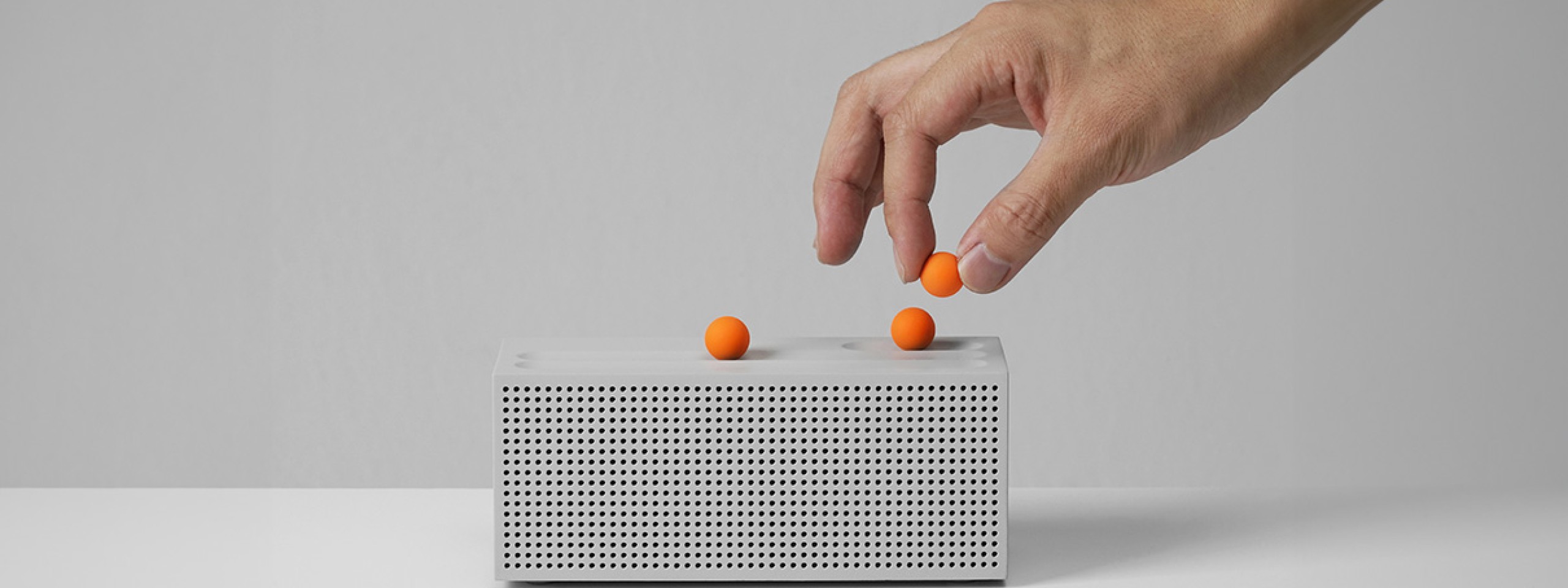
Tactile User Interface (TUI) is all about reintroducing the sense of touch into the digital realm. With a reliance on tech during the pandemic, many users are tired and wary from spending too much time on digital devices. TUI seeks to address this by reintroducing physical elements and tactile sensations into digital products, such as buttons and switches, textured surfaces, feedback through vibrations and moving elements.
This approach taps into digital minimalism and the desire to engage more intentionally with technology. Is has cross-demographic and cross-generational appeal.
Here's why it's relevant for product design and UX/UI:
- Engaging the senses for deeper emotional connection: Tactile interactions can evoke more engaging user experiences. Buttons that respond with a satisfying click, sliders that glide smoothly, and physical dials can create a deeper emotional connection, which can be a powerful asset for product designers. This will continue to be key as even more time is spent online and among nostalgia-seeking Millennials and Gen Z.
- Enhancing usability, inclusivity, and accessibility: Tactile cues and haptic feedback provide clear and intuitive directions. Users don't need to decipher abstract icons or gestures; they can simply interact with the physical world. TUI can thus make digital interfaces accessible to a wider audience and break down barriers for elderly users or users with visual impairments.
- Providing a calmer and more intentional experience: Unconnected, tactile interfaces encourage focus and motivate users to concentrate on their present activity. Product designers can leverage TUI to promote relaxation or productivity.
- Bringing the familiar to the new: TUI allows designers to seamlessly blend analog and digital elements. Combining physical knobs, buttons, and dials with digital displays can provide users with the familiarity of traditional interfaces while harnessing the power of digital technology
- Increasing safety and reliability: TUI can increase safety and reliability and prevent accidental interactions with devices. For instance, a study of the interfaces in today's cars shows that buttons in cars are safer and quicker to use than touchscreens. A physical button on a medical device may require deliberate pressure to activate, reducing the likelihood of accidental input.
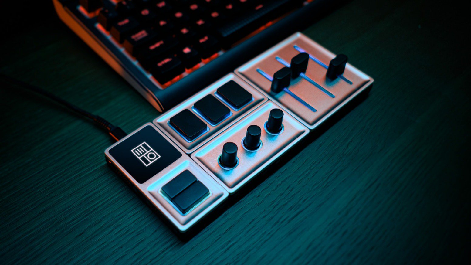
Monogram, widely popular among creative professionals, is a free-form hardware interface that offers tactile controls (dials, buttons, sliders etc.) to make interacting with creative software more engaging, intuitive, and faster.


Zero User Interface (Zero UI): Towards Screen-less Devices
On the other side of the spectrum, we have Zero UI, which seeks to minimize or eliminate traditional screen-based or physical interfaces altogether. This trend is fueled in part by digital fatigue. The pandemic has also increased the demand for touchless solutions. Instead, users interact with devices trough voice, gesture, and touch.
Zero UI relies on technologies such as voice recognition, gesture control, motion sensors, and predictive artificial intelligence (AI). It seeks to make technology as discreet as possible, and integrate it seamlessly into our surroundings. Some screenless future scenarios even go so far to postulate that, with the help of ambient intelligence, products will be able not only respond to users' requests and actions, but will even proactively anticipate their needs.
Certainly, natural language processing and speech recognition technologies, along with sensor-based technologies, have matured. Zero UI will become more prevalent - and accepted - in the coming years. Voice assistants like Siri, Alexa, and Google Assistant have popularized voice commands. According to a study by Edison Research, nearly 35% of Americans over the age of 18 owned a smart speaker in 2022. And the number is growing.
Here's why it's relevant for product design and UX/UI:
- Simplified experience and enhanced efficiency: Zero UI allows users to communicate with devices and systems in ways that mimic real-world interactions, using a combination of spoken commands and intuitive gestures. It simplifies interaction by removing the learning curve associated with traditional interfaces and can streamline tasks. This can be a game-changer for complex interfaces, such as in context of healthcare. For instance, voice-activated medical devices can be a boon in high-stress situations, allowing patients and healthcare professionals to control devices and access information effortlessly.
- Accessibility: Zero UI opens up great opportunities to make products more inclusive. Voice commands, for instance, empower users with disabilities or elderly users struggling with technology by providing an alternative means of interaction that doesn't rely on physical actions or visual displays.
- Enhanced convenience: Think of controlling your smart home with a simple voice command; it's all about making life easier and spending less time fiddling with devices.
- Improved hygiene: Zero UI can minimize physical touchpoints and reduce the risk of contamination, making it an ideal choice for medical products, especially in the post-pandemic world.
- Data, privacy, and trust: Zero UI means rich data for the owner of the technology and product. It also presents major challenges around ethics, privacy, accessibility, and informed consent. Designers and companies need to take multiple measures to build trust, offer transparency, and ensure that data is protected.


Best practice recommendations from Milani
Incorporating Tactile User Interface (TUI) and Zero User Interface (Zero UI) into your product development can be a powerful strategy for creating products that resonate with users, are accessible to all, and provide cutting-edge user experiences.
Keep in mind that these two UX / UI trends are not mutually exclusive; they can coexist and complement each other in product design to create hybrid interfaces that offer the best of both worlds. For example, integrating tactile feedback into Zero UI devices can provide users with reassuring confirmation of their actions. A voice-activated smart home system could provide subtle haptic feedback when a command is executed.
6 recommendations to incorporate TUI and Zero Ui into product development
-
Consider industry-specific application and requirements. Expand your product roadmap to identify longer-term opportunities for your industry. For example, in consumer goods, TUI may be more relevant for creating engaging and tactile experiences, while in healthcare, Zero UI may offer streamlined and hands-free interactions, either for healthcare professionals or aging populations.
-
Prioritize user-centric design and diversify testing. Always keep the user needs and experience at the forefront of your design process. Co-design with a wide group of users and test products across extensive scenarios, to ensure inclusion, accessibility, and identify unintended consequences.
-
Foster collaboration across disciplines and arts, and work with designers, engineers, psychologists, and other creatives such as artists and dancers. TUI and Zero UI implementations require interdisciplinary teamwork to understand how people behave and naturally interact to design intuitive systems.
-
Does your product really need to be connected? Reassess whether Bluetooth or Wi-Fi connectivity is necessary and adds benefits. Introduce lo-tech modes that turn off which are less distracting, use less energy and data.
-
Embed ethical guiding principles and define boundaries from the beginning of your projects. Build in simple opt-in or opt-out settings and make it clear how devices are making decisions on the users. Guarantee robust security measures to protect data and maintain user trust.
-
Last but not least: Be playful! Get creative to identify new areas of possibilities. Stay open to designing multimodally, and combine gesture and voice, whenever it’s relevant. You can give analogue products expressive feel with retro graphics texture or both tactile and acoustic feedback

