Complete Modernization of the SBB Pictograms

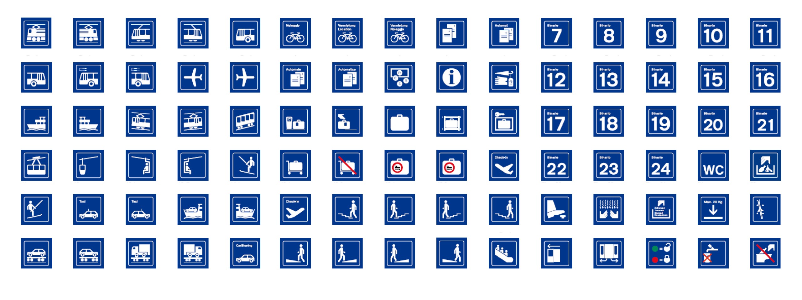
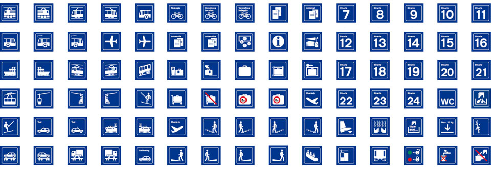
The design agency Milani has completely modernized the pictograms of the Swiss Federal Railways (SBB). Around 260 pictograms were re-categorized, hierarchized, modernized, and in some cases redesigned.

Challenge: Modernizing an Established Signage and Pictogram System
How do passengers find their way around stations and trains? Most of them are probably guided by the ubiquitous pictograms. The SBB pictograms are part of a protected signage system dating back to 1982. They were created by well-known designers, but some of them no longer correspond to today's understanding.
Some signs had visibly become outdated due to technological and societal changes. At the same time, certain pictograms used in cross-border rail transport had to comply with new European standards. The challenge was to modernize the established system without losing its clarity and consistent visual language.
Approach: Categorization, Hierarchization and Signage Redesign
The Swiss Federal Railways (SBB) have been working successfully with Milani for many years. Numerous joint projects have been realized, including the redesign of the pictograms. Milani re-categorized and hierarchized the approximately 260 existing pictograms, modernized outdated signs, and developed new pictograms. Complex information had to be reduced to simple graphic symbols that could be understood quickly and as independently as possible of language and culture, while still functioning as part of a consistent SBB visual language. In the process, Milani adapted some pictograms to current safety and European standards.


Result: SBB Pictograms for the Digital Age
Even seemingly simple signs show how much our visual world has changed. The former PC with a floppy disk drive became a laptop, while the mobile phone with an antenna and keypad became a smartphone. The redesign adapted the existing pictogram system to new technologies and requirements. At the same time, the central purpose of the SBB pictograms remained unchanged: to communicate complex information simply, quickly, and as independently as possible of language and culture.
The modernization of the SBB pictograms also attracted media attention. The Swiss business magazine Bilanz reported on the project and Milani’s work.
Milani Services
- Categorization and hierarchy of existing pictograms
- Modernization of pictograms
- Development of new pictograms
- Design Guideline
- Application of the new TSI standards
- Transportation Design